From a million-dollar ad campaign to your company email signature; every interaction your company has with an audience is an opportunity to communicate your value and further establish brand identity.
Take Google - one of the world’s most recognizable brands. Google’s material design approach means that every button, loading screen and font color says something about the global tech giant.
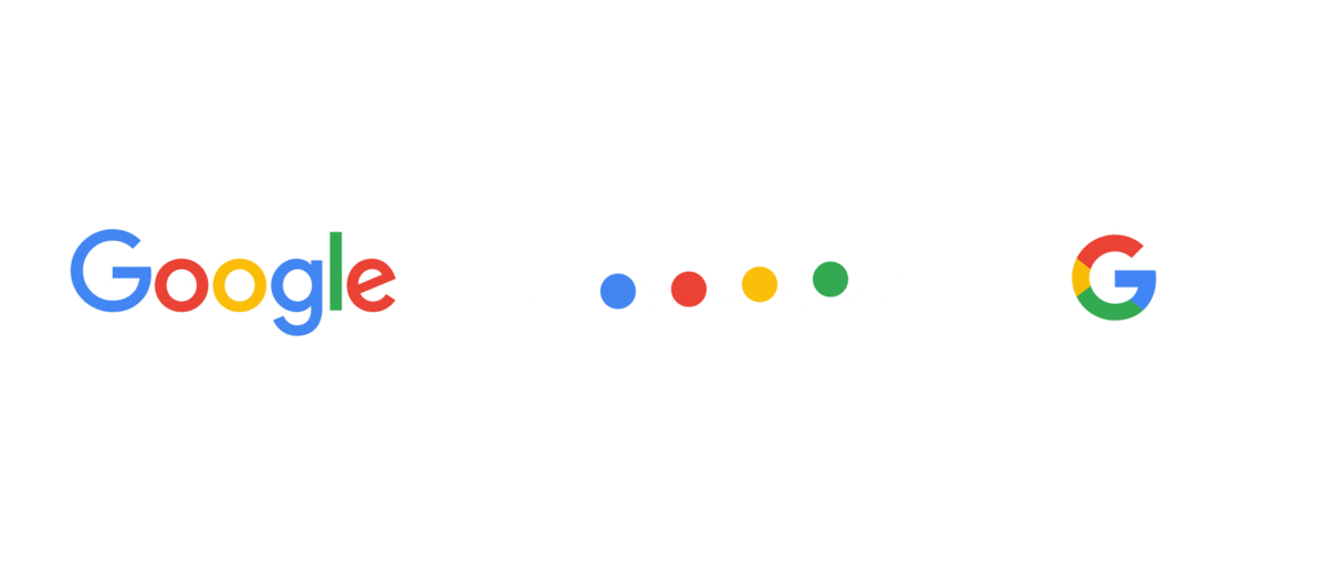
The Google Doodles project shows that the brand isn't afraid to experiment with their logo. The branding team is still in control, even when their homepage logo is drastically different from their standard logo (i.e. as an excellent take on the PacMan game) because Google manages to subtly but effectively always communicate the explanation for the change, which can then often become newsworthy for all the right reasons, further increasing Google's brandpower. Great work, Google!
This consistent attention to detail, big or small, is what makes Google one of the most successful examples of corporate branding to date. The level of control that branding teams at Google have over Google's websites is far greater than the control they may have over Google's employee email signatures. Google has over 72,000 employees who we imagine send a lot of emails. But it can be very difficult keeping the content in employee email addresses as consistent and on-brand as other traditional brand touchpoints.
With employees reportedly sending around 40 external emails a day, your email signature design is a brand interaction worth getting right.
When you communicate with a customer via email, it's the logo and information in your email signature that they will see on a recurring basis. However, as it’s often left to employees to manually update an email signature, this branding touchpoint is often overlooked, becoming an unnecessary risk to your brand identity.
Read next: 5 unbreakable rules of email signature marketing
To help avoid undoing any brand or rebranding strategies, we’ve outlined eight essential design commandments that you should follow when designing and managing effective email signatures. And to put these theories to the test, we've also attempted to create a "best practice" email signature following these principles.
If you're reading this article you probably know a thing or two about email signatures, maybe more than we do! Please share any of your best practice techniques in the comments section below.
So, here's how to create the best email signature design:
1. Design by hierarchy
The best email signatures use design to guide a reader’s attention through an information hierarchy.
So before you start bolding, scaling up or adding color to any part of your email signature design, you need to be clear and selective on the order of importance you attach to the different aspects of your signature content. Begin by ordering the information that the email recipient 1) needs to see and 2) may want to see .
Do you really need your company’s physical address? Are your social channels more important than your website URL? Depending on your company and the purpose of your email, different factors will have more importance. For example, your social channels may be a validation point for the recipient of a cold outbound sales email, so they should have more prominence than your phone number.
Similarly, you can’t bypass a design hierarchy by adding a different design element to each - having your company address italicized, sender name bold and font size 14, email address in blue and social icons animated. The result will be a digital mess that conveys a somewhat schizophrenic brand identity. Effective email signatures build on minimalist designs with clever, extenuating touches.
2. Embrace space
Blank space or white space is the area between the elements of a design, as seen in some of the most recognizable logos of our era (e.g. Apple, Nike, Facebook, Tesla). Paring back the noise and embracing the white space could help you create one of the best email signatures in your own industry.
Research has shown that giving an online reader even slightly more space between digital elements increases legibility and comprehension by 20%. Applying more white space in your email signature design also forces you to take a more Coca Cola view on branding: “If it doesn’t add anything we take it away.” More white space means less words and less clutter, helping your email design to be more concise.
3. Don’t go font crazy
Rule 101 in email signature design is a non-negotiable – use no more than two or three (maximum!) fonts. Design elements should work together to elevate your key messaging, not distract or confuse the reader.
If finding well-paired fonts is proving difficult, an easy go-to is to keep it in the family. Choose a typeface with a variation of font family options - from bold to thin, light to black.
For example, Sony is set with a typeface called ITC Avant Garde in four different weights: Book, Book Condensed, Medium and Demi. The styles are designed to complement each other while creating visual differentiation between chosen segments of your email design.
4. Keep the color palette simple
Adding a pop of color is an easy, effective way to make your email signature design standout. But it's a fine balance - it shouldn't be too loud and distract from the body text of your email.
Like with fonts, it’s best to keep things simple to avoid color clashes or a distracting email design that’s more reflective of a rainbow than your brand identity (unless you sell rainbows, in which case, go for it). Brand elements such as your logo or website should give you a strong steer on color palette choices.
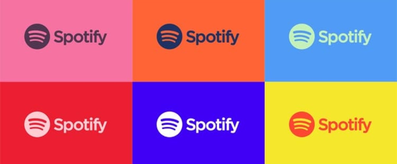
That said, brands like Spotify are able to keep communications on-brand while opening up a wider spectrum of color options to appeal to their wide audience of music-lovers. They’ve created a color and brand guide for this purpose. So if you plan to use a diverse range of color in your email signature, make sure your design team provide you with a list of specific and approved color Pantones.

5. Use social icons to host links
A study by Neomam Studios recently revealed that it only takes the human brain 100 microseconds to attach meaning to a symbol. When economy of space is a key issue for even the best email signature design, switching long URLs for link-hosted social icons is an easy win. It’s a fast, visually attractive way of introducing a new audience to both company and private content channels.
Stick with the ‘less is more’ theme and keep your range of social icons both professional and to a minimum. Declutter your social media offering by focusing on the main channels your target audience will use, and the channels with your strongest content offering.
With symbols as recognizable as the LinkedIn, Facebook, Twitter and Instagram avatars, you don’t need to compromise on your email signature design. Instead, use colors and icon designs that fit with your company’s unique branding style guide.
6. Be dynamic
Space permitted, adding dynamic content in your email signature design such as a marketing campaign, recent tweet or link to a high performing blog post, can encourage click throughs. Unilever, for example, reported an increase in followers from 40,000 followers to 235,000 in less than 10 months after it added a LinkedIn ‘Follow’ link to its email signatures.
This more subtle invitation to engage with your work can apply to anything from your e-book to award-winning marketing campaigns; with more options available if dynamic software is used for each employee, department or target audience.
A solution like Templafy gives marketing teams the power to roll out marketing campaigns and other dynamic content across an entire organization. For example, a special "Happy Holidays" email signature design could be rolled out for the festive season, or you could celebrate company achievements by including a "Winner of the Most Magnificent Business Award 2017" design in each employee's email signature.
The software also gives marketers granular control of the roll out so that, if they choose, the marketing campaigns will only attach to the email signatures sent from particular business units or employees
7. Optimize your design for mobile
With an average 56% of emails opened on a mobile in 2016, your company’s email signature design needs to look good across all devices.
The main stumbling block when aligning email design with mobile platforms is image size. Images need to take into consideration the pixel width of a mobile screen or they’ll either distort or not display at all. This will both look unprofessional and also lead to the risk of a reader missing vital information below your image.
You should also consider breaking up the copy in your email signature onto parallel lines so that all text fits neatly in the screen rather than untidy copy breaks that make it hard to read.
8. Stay in control
Although any effective email signature design needs to strike a balance between the professional and the personal, you should treat its branding credentials the same way you would your logo’s.
Imagine giving all employees unregulated and unlimited access to tweak your logo on a daily basis. No matter how technically or artistically talented these individuals are, pretty soon your symbol of once coherent brand identity would transform into a complete branding mess.
Templafy’s Email Signature Manager keeps branding teams in control of email design while giving each employee the personalization that their online sign offs require.
Irrelevant of company size, with every email sent or received, the software solution dynamically merges company-relevant information with the latest personal data. It automatically attaches the right email signature created on behalf of each user with a look and feel that corresponds with your brand specs.
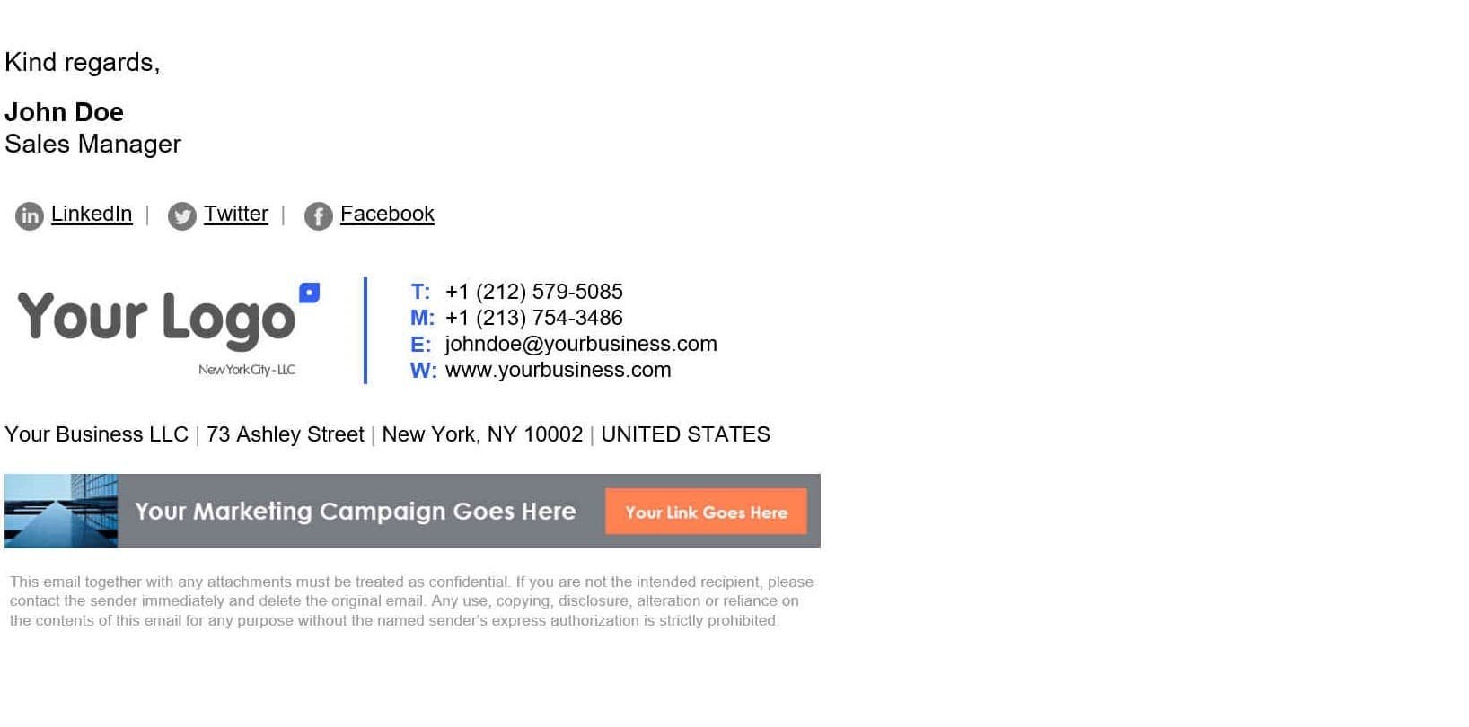
The result
Drumroll please! Here's an example of what your beautiful employee email signature design could look like using these email design fundamentals:
Have any thoughts on our best email signature design? We'd love to hear them!